Howard Payne University announced a branding update for the university’s main logos and corresponding brand identity across campus departments. The branding refresh brings a cohesive look to the main university identity and the Department of Athletics.
“We look forward to increasing brand recognition and connection to HPU through these new designs,” said Dr. Cory Hines, university president. “HPU’s brand and visual identity play a crucial role in the university’s continued success and promotion. As always, when people see the HPU brand it is our desire that they know it represents quality, Christ-centered higher education.”
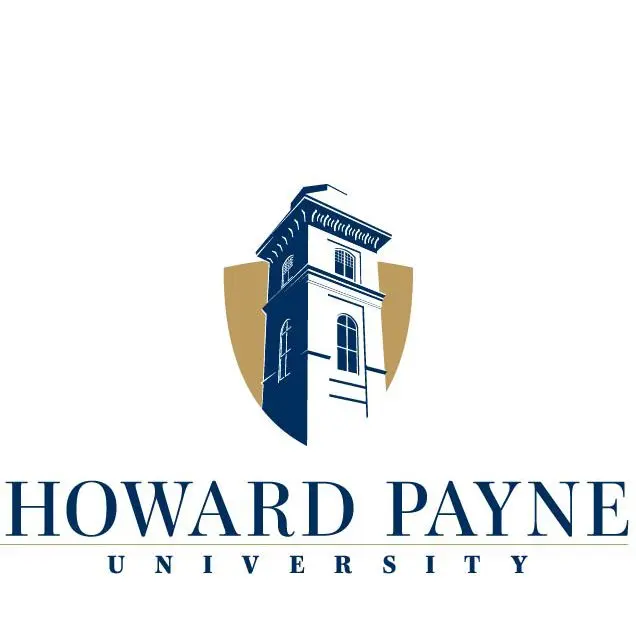
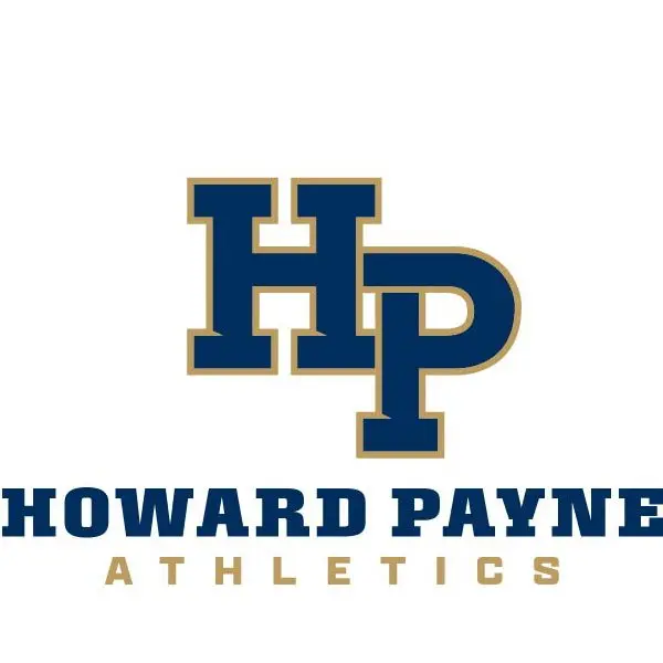
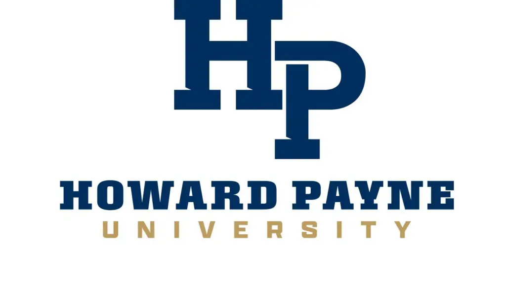
The new branding was developed in the spring 2025 semester and is currently being implemented across campus. The new main logo features a prominent HP and new fonts. The branding also includes an updated color palette that stays consistent with the school colors of old gold and navy blue.
The athletic logo features an outlined HP in gold and the wording “Howard Payne Athletics.” Corresponding logos have been developed for each of the university’s athletic teams.
The academic logo will be used for promotion and communication within the university’s schools and academic departments. It features a new shield with the Old Main Tower displayed in the center. The tower is a notable structure in the center of campus and is a replica of the entrance of Old Main, the first building built on campus in the late 1800s, which stood for almost 100 years.
For more information about the HPU logos and brand guidelines, contact the Office of University Marketing and Communications at communications@hputx.edu or by calling 325-649-8009.